


Colour Theory
Social Housing Ymere
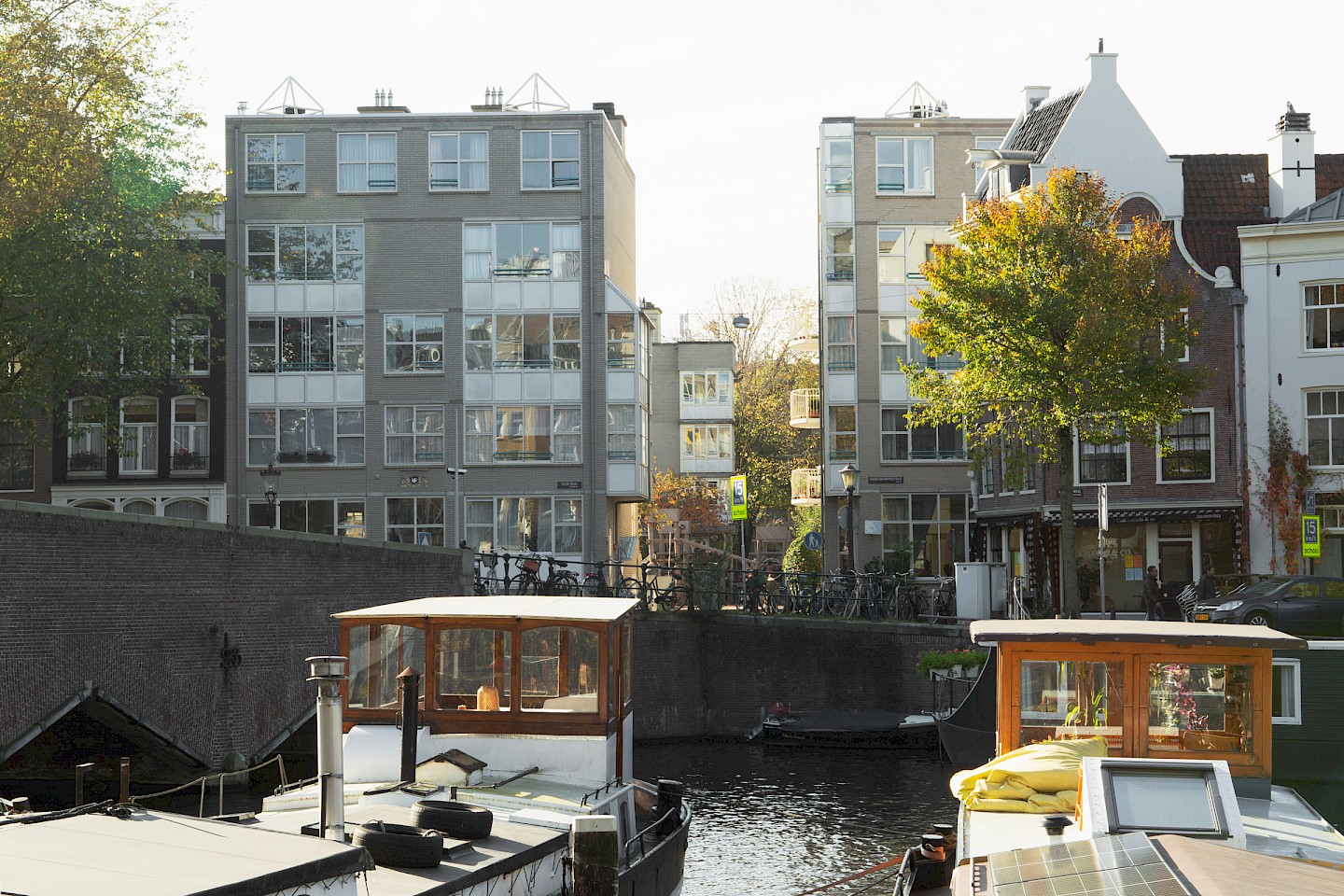
Amsterdam | NL
2018
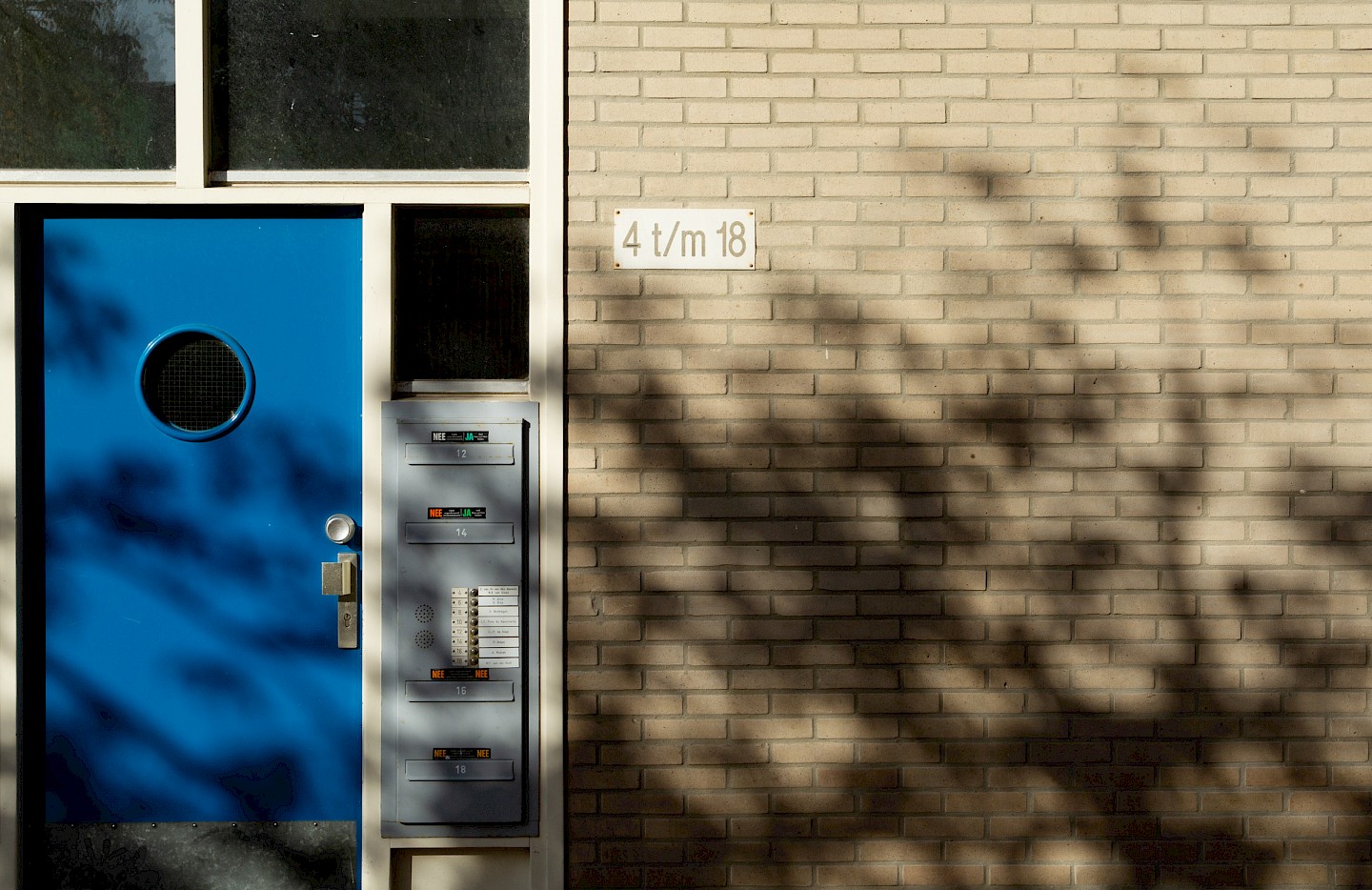
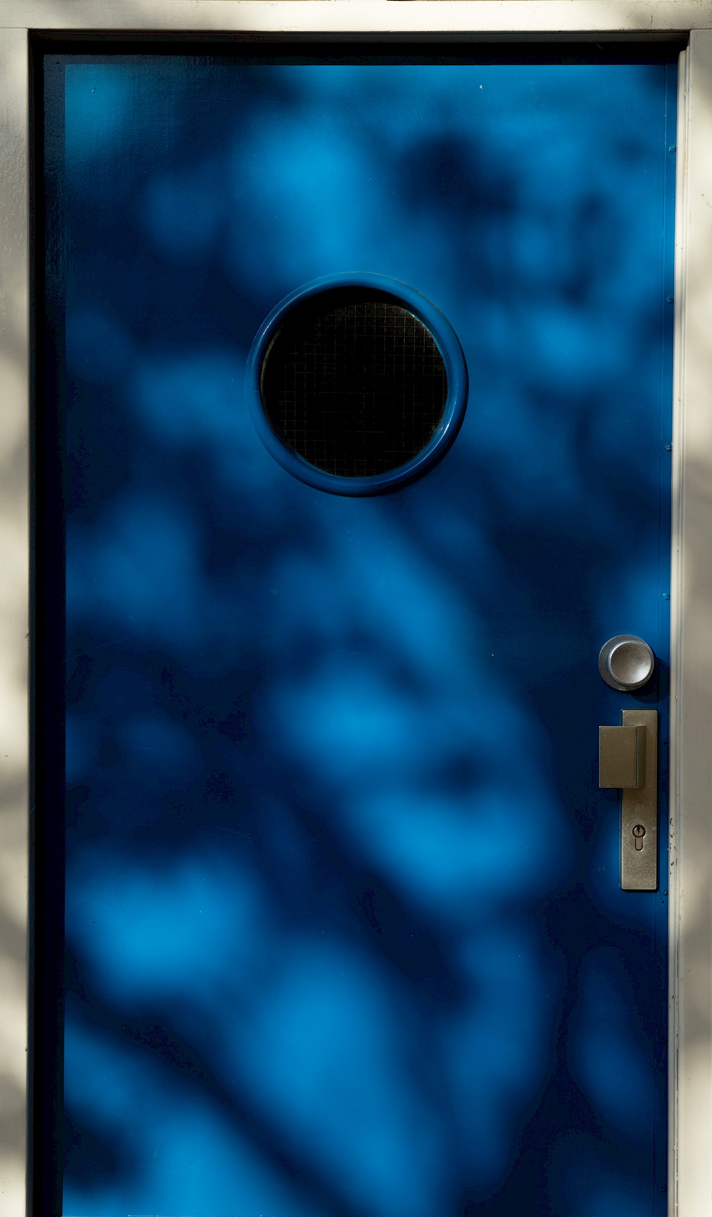
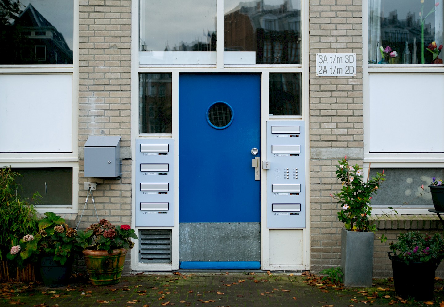
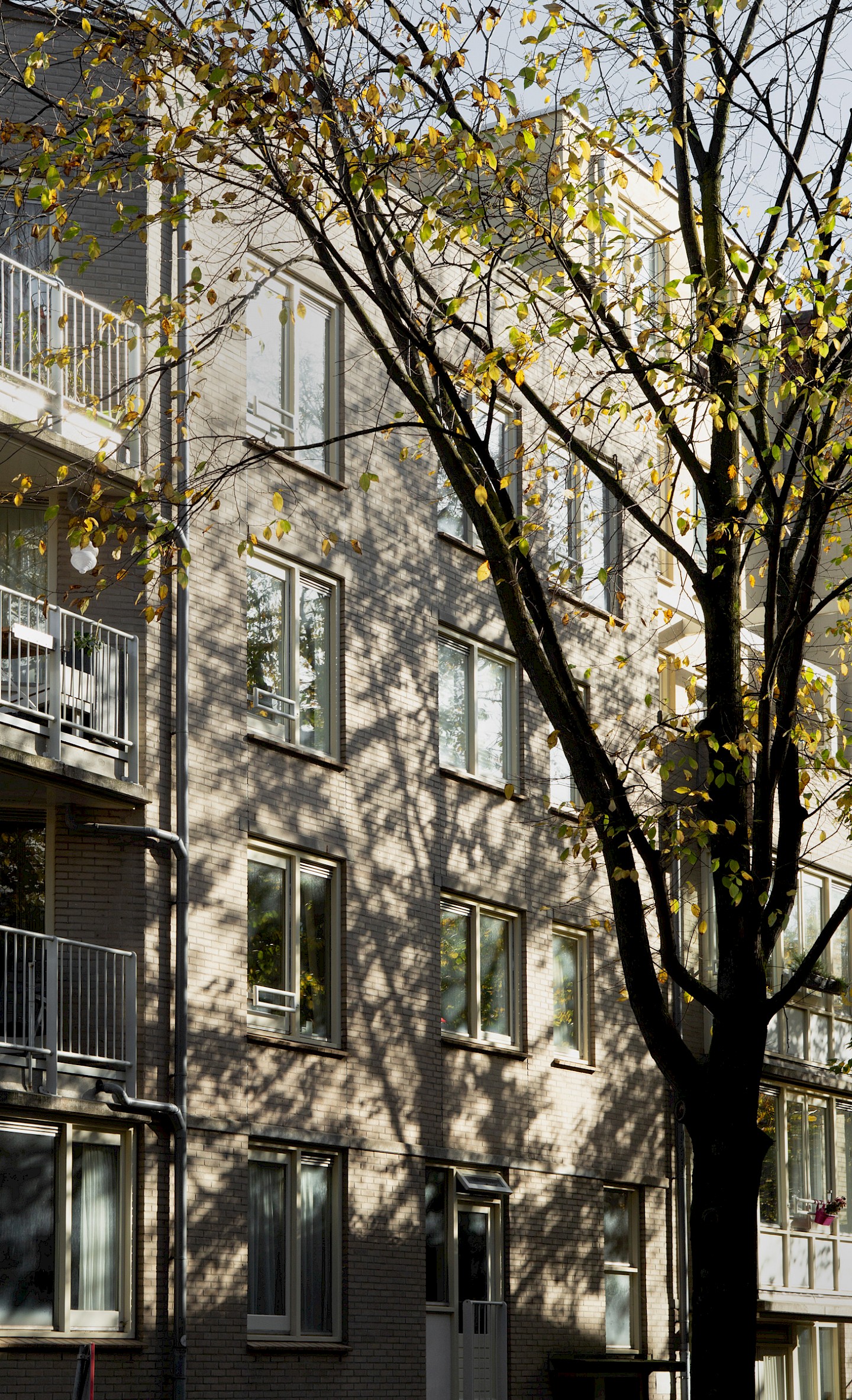
The paintwork of a housing block can really define the character of a street and even a neighborhood, yet it does not often get a lot of attention. Social housing corporation Ymere chose to do things differently: for the next round of renovations for several of their Amsterdam projects, they asked us to consult on the colour scheme.
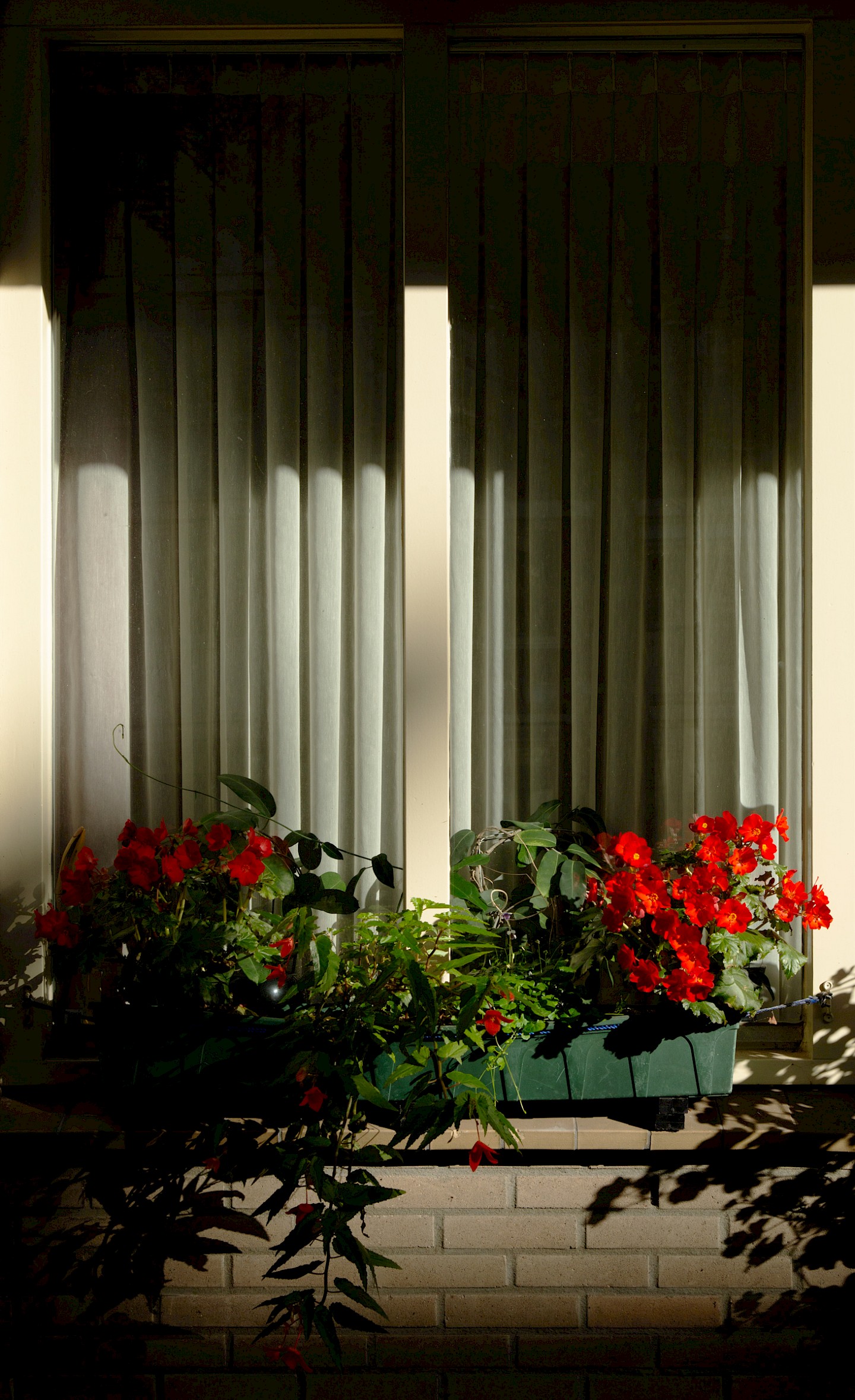
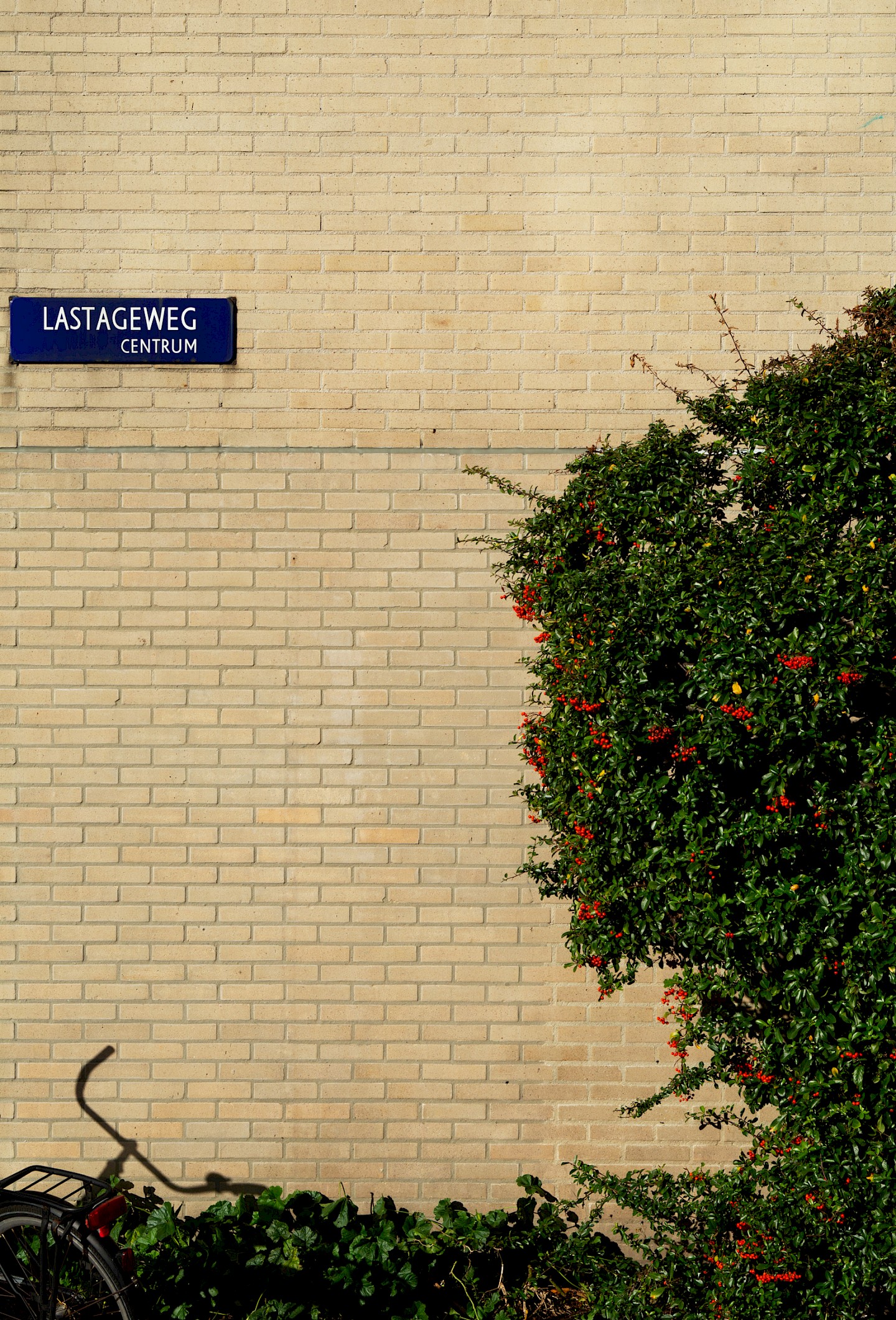
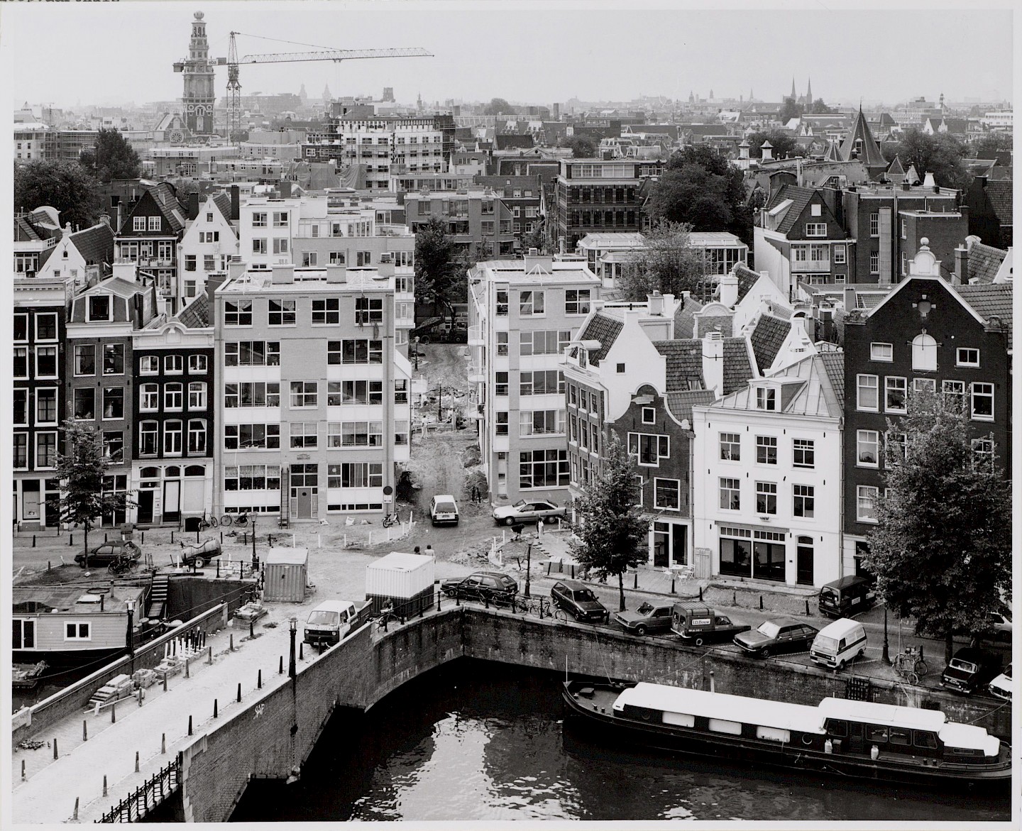
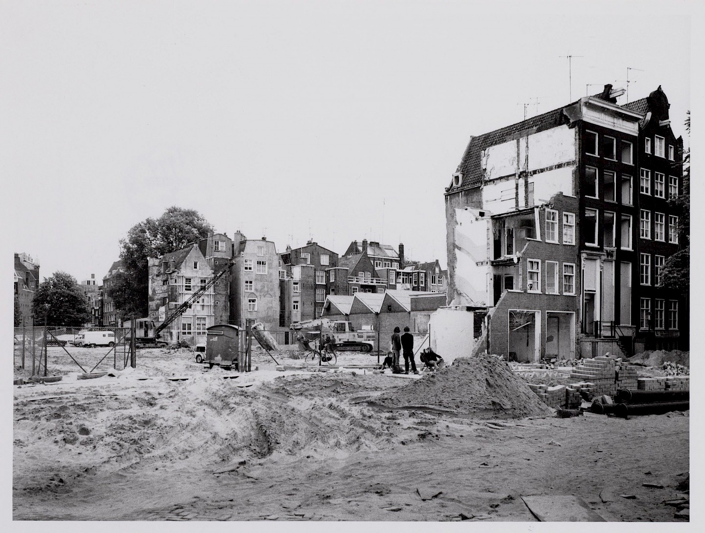
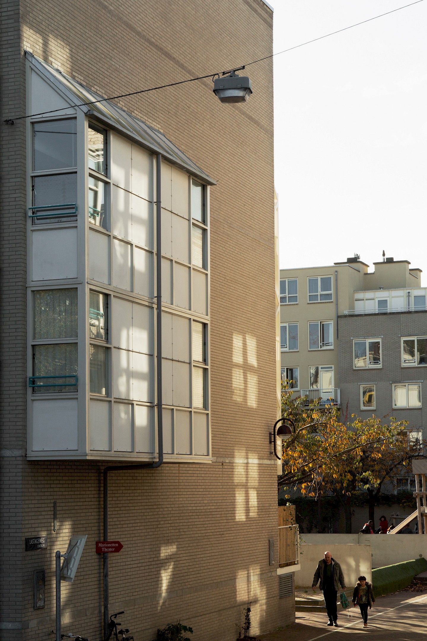
A thorough analysis of the history, structure and location of the housing blocks became the base of our proposal. We delved into the city archives and discovered photos that - even though they were mostly black and white - still revealed a lot about the original shades. Examining the structures provided insight which elements of the paintwork could be separated or grouped together. But most importantly, a location visit gave us the chance to experience the different neighborhoods and the buildings’ surroundings, how the light changes during the day, and how the greenery effects the atmosphere.
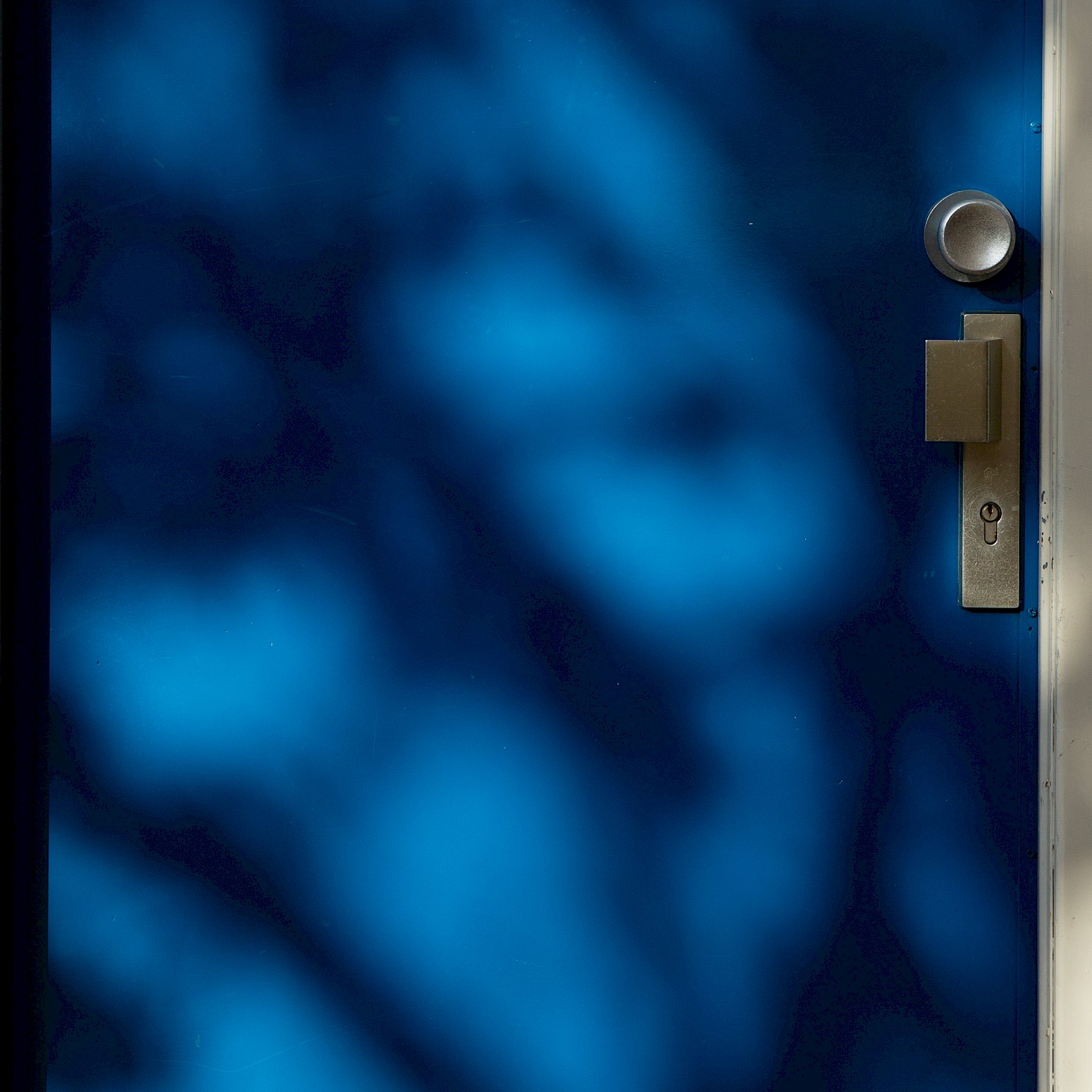
The computer program Colorjive allowed us to digitally organize all this information and subsequently manipulate and play around with a variety of colour schemes, resulting in two proposals that each consist of four base tones and two accent colours. These were presented to the residents, who, as daily users, had the final say.
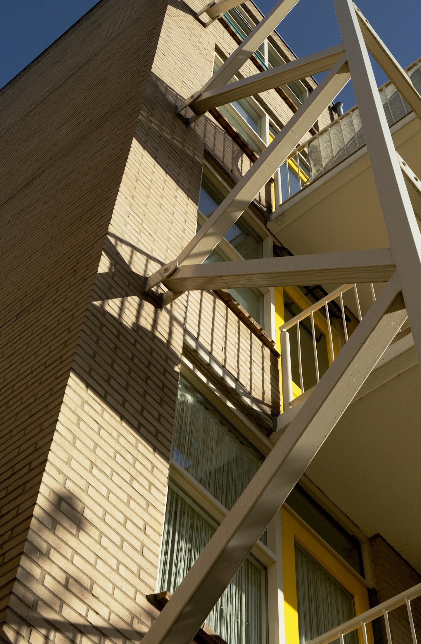
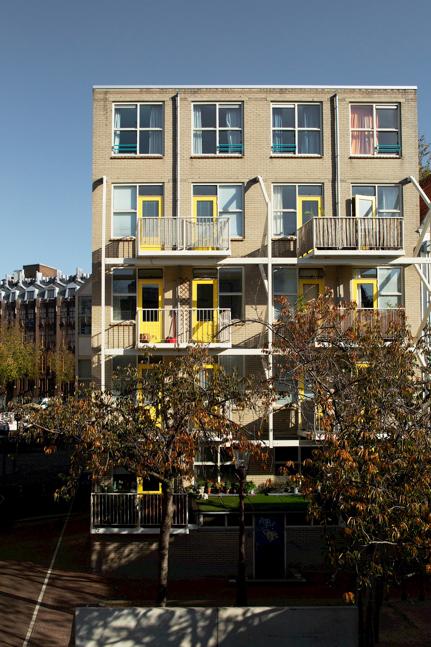
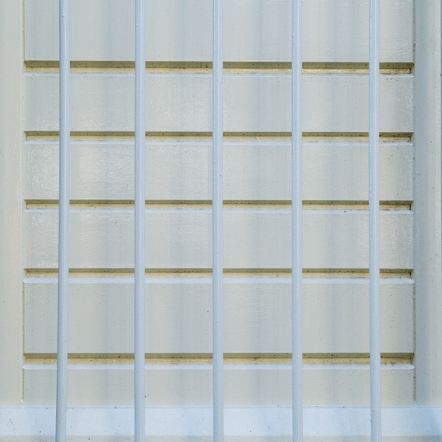
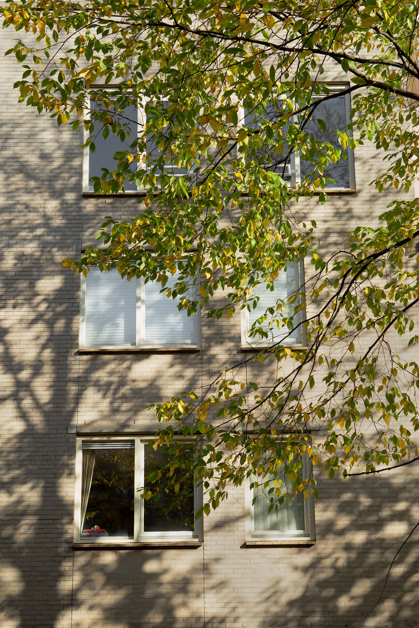
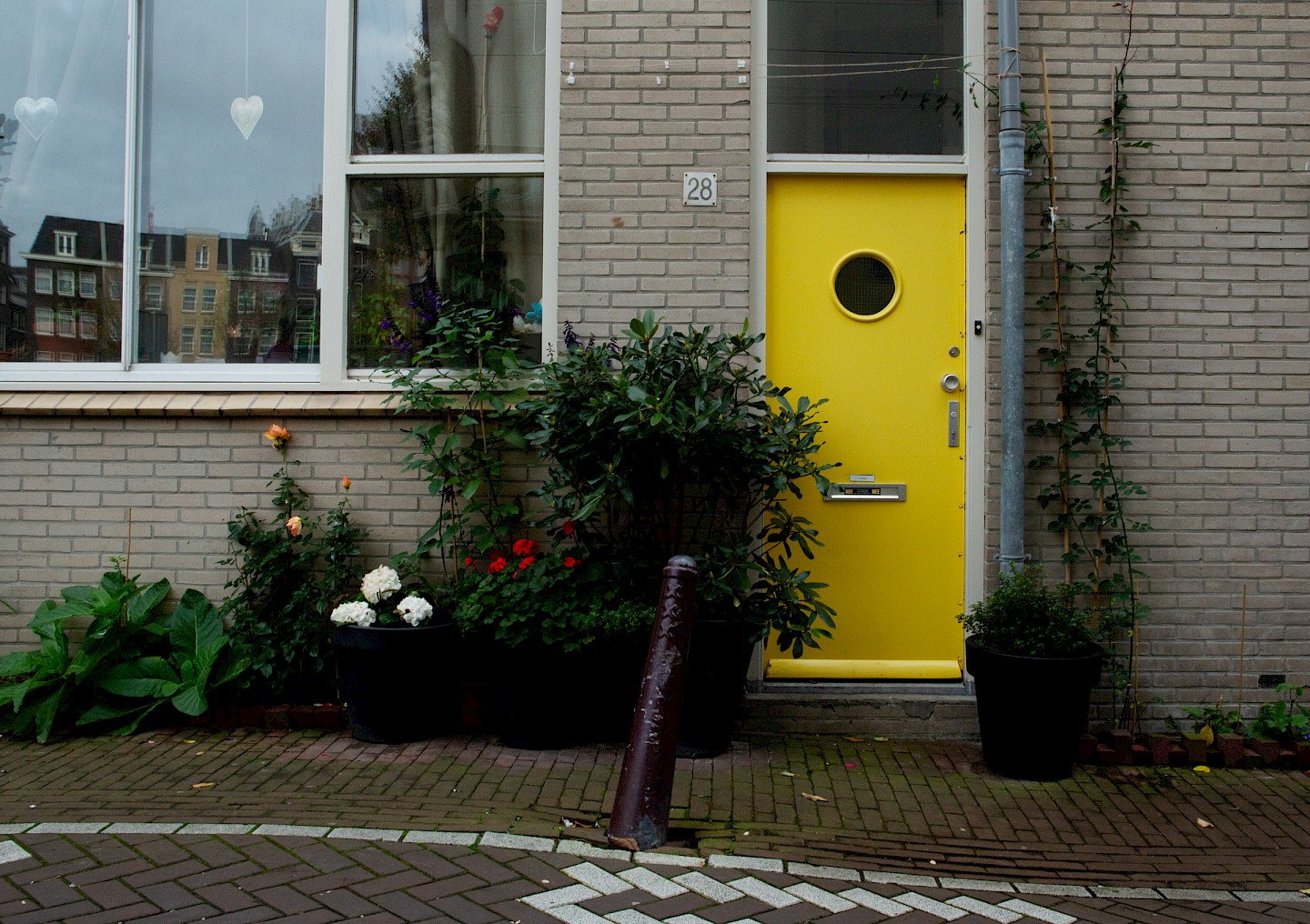
The facades of these housing blocks, mostly built in the crisis years of the 1980s, lacked structural definition. By accentuating some distinct elements — a balcony, an entrance, a dormer, a window frame — and downplaying others, a thoughtful use of colour has introduced much needed depth and rhythm. This way, new paintwork becomes much more than a superficial refresher: it breathes new life into an entire street.